Envato Tuts+ Tutorials |
- How to Make Multi-Source Live Stream Video for Free With OBS.Ninja and OBS Studio
- How to Make Great Startup Pitch Deck Presentations in Apple Keynote
- 20 Best Free Microsoft Word Resume CV Cover Letter Templates 2021
- How to Customize Contact Form 7 for WordPress: Floating Labels
- 20+ Cool Clothing & T-Shirt Company Brand Logo Designs for 2021
- How to Save a PDF in Affinity Publisher (For Web & for Print)
| How to Make Multi-Source Live Stream Video for Free With OBS.Ninja and OBS Studio Posted: 21 Dec 2020 01:20 PM PST The Group Chat in OBS Ninja lets you easily control media feeds from multiple participants, and sends live streams to OBS Studio for broadcast. A director's room feature lets you manage settings and communicate with your participants outside of the broadcast. In this tutorial, learn how to easily add multiple remote contributors to your live stream for free with OBS Ninja and OBS Studio. 1. Set up a Group Chat Room in OBS.NinjaHead over to https://obs.ninja and click Add Group Chat to OBS.  You'll need to give your chatroom a name (with no spaces) and it's wise to choose a password too. In theory someone could create a room with the same name as you, but it's highly unlikely you'd both also choose the same password.  Here's a quick breakdown of what you can see: Guest InviteYou give this link to those who you want to join your chat or broadcast – they'll be asked to put in a password if you've assigned one, so you'll need to give them that too. Other guests will be able to see and hear each other. Broadcast InviteThis is a broadcast only link, so any users you give this link to will be able to broadcast their feed but won't see or hear the rest of the group. Scene Link: ManualThis is a link to add the feed as a browser source in OBS Studio. You can add each guest by clicking Add to Scene. Scene Link: AutoAs above but any guest using this link will automatically be added to a scene rather than you assigning them individually. As each guest joins, you'll be able to see them in the Guest slots at the bottom of the screen. The guests can decide whether to share their camera, audio or screen. When someone clicks your link, they'll see this:  If they've got more than one camera and microphone option they can choose which to share. When they hit 'START' they'll appear in your room.  You've got a few extra controls once someone is in the chat. You can record their feed, add them to another scene, transfer them to a different chat room, adjust their audio volume, mute them, kick them out, or send them a message.  As each person joins the chatroom you'll see them as above, in their own little sections. You'll see an option to copy solo link, which will take that particular feed's audio and video for you to use elsewhere but still let you control it from the main chat room if you want to. Add Your Source (Solo Link) to your Broadcasting SoftwareCopy that link for use in your broadcaster – we're using OBS Studio. You'll need to add it as a source; it's probably easiest if you create a scene for each participant and then add their feed as a source, as it can be easier to flip between scenes than sources. We look at how to add scenes and sources in this article:  Add the link to a scene as a browser source and you'll see that feed appear in your main window. Do this with each participant's link and you've got everyone in one place, with all the benefits of OBS Studio like any graphics and animations you may have saved for your broadcast. You could also use this method if you wanted to have two cameras on yourself while you're broadcasting, and still control everything from OBS studio. If you're doing that, remember to switch off the audio on your second camera or you'll create a pretty terrible echo. The AWS Blogger has a great example of using OBS Ninja's chatroom feature as a second camera source. There are more great ways to add remote video sources to live streams with OBS Ninja, too. More Video Resources From EnvatoRead the Envato Video Marketing GuideBoost your video marketing skills with our comprehensive guide: You'll learn video marketing from start to finish, so that whether you're a novice or a pro, you'll learn some useful skills that will improve your next video. Download Free Video, Free Music, and Free Motion Graphics Templates From MixkitCheck out Mixkit for free stock videos, free stock music, and free templates for Adobe Premiere Pro. Yes, free! Make a Motion Graphics Video Online With PlaceItYou don't need professional software to create visually-appealing videos, you can make them right in your browser: PlaceIt is an online service with a video maker uses professionally-designed motion graphics templates. Envato Elements: Unlimited DownloadsEnvato Elements offers millions of stock items: photos, music, video clips, fonts, graphics templates of all sorts, video project templates for After Effects, Premiere Pro, Final Cut Pro and Motion, and creative courses from Envato Tuts+, all with a single subscription. Try These Live Streaming Articles Next |
| How to Make Great Startup Pitch Deck Presentations in Apple Keynote Posted: 21 Dec 2020 05:55 AM PST Apple's founder, Steve Jobs, made some of the most famous keynote presentations of all time. Compelling narratives and striking visuals made his Apple Keynote presentations memorable. Learn what how to make a great Apple pitch deck in this article. .jpg) If you're a novice or a budding entrepreneur, how can you build success into your startup pitch deck presentation? To help you win over potential investors, we've created six practical steps on how to make a great presentation in Keynote. Plus, we've also curated some of the best looking startup keynote templates from Envato Elements. So, you won't have trouble creating a pitch deck from scratch. Let's start getting your funding! Why You Need a Standout Pitch Deck DesignTo help you launch, scale, and expand your business, you must have interested investors lined up to support your financial needs. And because a large sum of money is involved, you can't just easily get potential investors to open up their wallets for you. That's why a startup pitch deck is crucial to persuade future investors to bet on your business. When you present your business idea, you need a visual guide that your audience can easily grasp and understand. A great pitch deck keynote presentation will help you create a gripping narrative. Hook your potential investors and keep them focused along the way. It'll also convey your thoughts and message much more effectively. But how exactly do you create a pitch deck that stands out using Apple Keynote? How to Make the Best Keynote PresentationThere are many ways on how to make a great presentation in Keynote. While you can build your Keynote presentation from the ground up, there are already amazing templates that you can change using our step by step guide below.  To get you started, we'll use this high-quality pitch deck template, Manola Pitch Deck Keynote Presentation, and make a few tweaks along the way. This will help you better suit your startup pitch deck according to your brand. Here are six steps to follow: 1. Hook Your Audience From the StartThe first two slides of your Apple Keynote presentation are where you'll create your first impression. It's an all-crucial rapport builder. Early at this stage, hook your potential investors with a compelling introduction to hype their interest as you proceed with your presentation. To have your audience's full and undivided attention, stir their interest by enticing them with how your startup business can benefit them. Answer this top question of your investors: what's in it for me? You can also use this part to define the problem or problems you want to address with your new business venture. For example, Airbnb's startup pitch deck commenced with a simple cover slide of their logo and tagline. Then they immediately follow it up with three short sentences analyzing the current gaps in the hospitality industry.  A problem statement immediately stirs the interest of your audience. What do you want to address? What are the current pain points of the market? With a problem statement, your audience would instantly get curious as to how your startup business can solve these problems. You can easily incorporate this approach into your own Keynote presentation:  Simply tweak the Manola Pitch Deck Keynote Presentation template to list down your problem statements. To make it more visually appealing, you can use icons beside each problem statement. 2. Build a Cohesive Visual Story and StructureA recipe to a great Keynote presentation is a narrative that your audience can easily follow. But this story should be paired with a riveting visual journey as well. Usually, you can use a progressive plot: setting, conflict, rising action, climax, denouement, and end. A progressive plot follows a chronological structure. It begins with the setting and conflict, then the rising action to a climax, and culminates with a denouement—just like in literature. To translate this principle to your startup pitch deck content, you can use the following:
 When Uber was still looking for investors, they made a startup pitch deck that follows a progressive plot. The most incredible part of this pitch deck was their "UberCab Concept" slide. It summarizes how their business idea can solve the transportation problem.
 An example of the use of denouement is this pitch deck from BuzzFeed. Two slides before it ends, it's got this "How Big Can This Get" headline. It lists all the future outcomes that the company envisions to achieve and why it would be the next big thing.
For each part, you can also assign different slide layouts. Move the positioning of your logo, texts, images, or add some graphics. This way, you can easily differentiate individual ideas and categorize related parts of your Keynote presentation. In another example, the original startup pitch deck of LinkedIn is a perfect example of how to make a pitch deck that combines a seamless narrative and visuals. It started with actual data on how people search for jobs.  Then it goes on to a slide explaining the implications of those data. It displays a problem statement and the existing gaps brought about by this problem.  To learn more about writing your cover slide, problem statement, and more, just study these five examples of great pitch decks. 3. Simplify Text With Typography and IconographyWhile your content is a highly crucial element of your startup Keynote pitch deck, you may go overboard by adding too many texts in one slide. Instead of long sentences, only put phrases to simplify your messages. You can just further explain these short phrases during your presentation. You can also use typography to make texts more appealing. Typography is the art and technique of arranging texts to transform written language legible, readable, and appealing when displayed on your Apple Keynote presentation.   This guide will help you navigate how you can reduce text-overload Keynote presentation by using typography and iconography effectively. It's also a good idea to replace texts with icons. The use of iconography in your presentation keynote design will make it more memorable and easier on the eyes. 4. Use a Consistent Color PaletteDon't be afraid to use colors in your Keynote business presentation. Colors influence human perception and emotions which gives them great impact on the decisions we make. It's an essential aspect of how to make amazing Keynote presentations. This is because colors give life and personality to your pitch deck. It's recommended to use a color palette that aligns to your branding. This is to avoid association with your competitors. You want to stand out from your direct competitors and at the same time instill brand recall. According to WebsiteSetup, here are the main factors to consider when picking color schemes:
To sum up: base your decisions on facts and data instead of intuition. You can also use colors to categorize different bodies of your keynote presentation. This also gives variety to your audience to ensure that they won't get bored with a monotonous color. Using the Manola Pitch Deck template, you can easily alter the colors on each slide and design a harmonious color palette.  5. Visualize Your DataFrom revenue figures, expense breakdown to supporting facts — you'll always encounter data when you're creating your startup Keynote presentation. You don't want to simply put numbers in there. Some of the best startup pitch presentations visualize their data to communicate insights from data through charts and graphs. This will also enable your audience to look at and explore your data from different perspectives. Visualizing data can help you identify patterns within that data and understand large amounts of information very quickly.  Read more about visualizing your data with this tutorial on customizing charts, maps, and other data. 6. Close With an Actionable EndingUnlike a fairytale story where you'll read "...and they lived happily ever after," you should end your Apple Keynote presentation with a clear and compelling call to action (CTA). You want your potential investors to make a favorable response after your Keynote presentation. This is the last chance for you to seal the deal. So, make this section count. Create a memorable CTA that'll continue the conversation between you and your future investors. For example, you can direct them to your website, sign up to your newsletter, or download your latest app.  This is exactly how Foursquare ended its startup pitch deck when they were looking for more investors. They've included some exciting trivia that'll surely make their exit more memorable. Plus, they closed it by encouraging their audience to sign up by visiting their website.  5 Top Modern Pitch Deck Apple Keynote Templates for 2021Designing your Apple Keynote presentation from scratch can be tedious, especially if you're not a designer yourself. Instead of spending days or hours perfecting your presentation, why not just get a professional startup pitch presentation template?  You've got a variety of startup pitch presentation templates out there. Envato Elements curates some of the most amazing Startup pitch deck Keynote templates to create a winning startup pitch presentation. With just a single subscription, you already have unlimited access to 1,300,000+ digital assets. We repeat: that's unlimited download for one subscription.  You now have the freedom to play, experiment and create your next startup pitch deck or any business presentation you may need in the future. To get you started, we've carefully handpicked the following three best premium startup Keynote templates: 1. Pitchus - Pitch Deck Presentation Want to know how to make a great presentation in Keynote? Starting with an Apple pitch deck like Pitchus is a great way to begin. This one has five dozen sleek modern slides to help pitch your big idea. With vector graphics throughout, you'll find this one to be stylish and easy to customize. That's the perfect combo to help you make a great impression. 2. Ambize - Pitch Deck Keynote Ambize is another winning pitch Apple deck option for 2021. It's got a modern vibe, using black and white tones throughout. The widescreen slide designs look great on any large display. Text and other content can be edited quickly, saving you precious time. You'll be able to focus solely on your message, rather than the tedious work of slide design. 3. Reven - Pitch Deck Keynote Presentation Make a winning startup pitch deck presentation with the Apple Keynote template. Its bold color and striking visuals can help you deliver your business idea much more impactful. From resizable shapes up to editable texts, this template is 100% customizable. This template is highly recommended for startup businesses in the banking, financial, information technology, digital, advertising, marketing, and business process outsourcing industries. 4. Union – Pitch Deck Keynote Template This startup keynote template combines all the necessary elements for you to build a great presentation for your startup business. From color variation, typography up to visual assets such as icons, you can fully customize this template for a memorable Keynote presentation. Ideal for organizations such as advertising, marketing, government, agency, manufacturing, insurance, outsourcing, branding, public relations, law, public office, telco provider, transportation, and the likes. 5. Pitch Deck Start Up Keynote Template With a modern finish, this Keynote presentation template embodies both functional and aesthetic features. Its versatile design can perfectly be applied to any industry out there. Choose from a variety of easily editable slides. This Keynote presentation template is perfect for health service, insurance, investment, environmental, hospital, medical, telecommunications, financial, eCommerce, and fashion industries. You can also find more templates in this article, 25 Best Keynote Pitch Deck Templates (Business Plan Presentation Designs). It contains some visually stunning Keynote presentation templates for your next startup business. More Great Templates for Apple Keynote DesignsKeynote pitch decks are so much easier when you use templates like the ones you saw in this article. We love sharing great templates that make it easier to build a pitch that launches you to success. See more of the best Apple premium deck templates below. Each of the designs gives you new options for Keynote presentations, and some might even work as Keynote pitch decks!
Where to Find the Best Startup Keynote Pitch Deck Templates in 2021 (Envato Elements vs. GraphicRiver)Envato Elements and GraphicRiver offer amazing Keynote pitch deck templates with beautiful modern designs. So, which site should you choose? It helps to consider the key advantages of each: 1. Top Benefits of Envato ElementsEnvato Elements is a membership-based resource for creative assets. For a flat monthly rate, you unlock unlimited downloads. That's a compelling offer. Download as many Keynote pitch deck templates as you want. Plus, you'll also find fonts, stock photos, music, and much more. With thousands of options for Keynote templates, you're sure to find the perfect one for your project.  2. Top Benefits of GraphicRiver (& Envato Market)GraphicRiver offers single downloads for purchase. That means you can find an Apple deck template and buy it—no membership required. You'll also find a vast array of other creative content. As a single-use marketplace, GraphicRiver helps you start projects quickly. Check out the top Keynote templates trending on GraphicRiver today.  Your Choice (Which Site to Choose?)If you build Apple decks often, or need a lot of creative flexibility, Envato Elements is the best choice. Unlimited downloads offer unlimited opportunities to explore and customize new layouts. Join Elements today!  If you simply need to build a stunning Keynote pitch deck for your company, check out GraphicRiver. It offers amazing content at great rates. Learn More About How to Make the Best Keynote Presentations and Pitch DecksTo learn more about making great pitch decks, this guide, How to Make Great Pitch Decks (Startup Presentation Guide), curates all your need-to-know tips and practical recommendations.
How to Quickly Customize Startup Pitch Deck Keynote Templates (For 2021)We've explored the best Keynote pitch deck templates available from Envato Elements. Now it's time to customize one to build your own startup pitch Apple deck. Let's learn how, in just five quick steps. Follow this mini-tutorial by downloading this beautiful premium Apple pitch deck from Envato Elements.  Let's get started: 1. Arrange Your SlidesAn Apple pitch deck template is meant to be flexible. They work for all kinds of businesses. Choose only the slides you need to make your own pitch Apple deck. In Keynote, click View and then Light Table. You'll see every slide in your Keynote pitch deck laid out in front of you. Click and drag to reorder the slides.  You can also hold down Command and click to select unwanted slides. Press Delete on your keyboard and they'll be removed from the Apple deck. When you're finished, go back to View and click Navigator to start editing. 2. Add Your TextChances are your Apple pitch deck is going to include a lot of text. Luckily, it's perhaps the easiest thing to edit in Keynote. Begin by highlighting the text you see on any slide. From there, go ahead and start typing. Your words will replace the dummy text.  Want to change aspects like font size and color? With the Format > Text sidebar open on the right side, those options and many more are just a click away. 3. Import ImagesImages should always come to mind when you think of how to make a great presentation in Keynote. An Apple deck like the one we're using makes adding them a breeze. Begin by finding an image placeholder on a slide. You'll recognize these by finding the photo icon in the lower right.  Then, simply drag a saved image over your slide and drop it into place. Keynote will import the photo automatically, sizing and scaling it to fit perfectly. 4. Customize InfographicsInfographics are key ingredients in any successful Keynote pitch deck. In essence, they're visuals that help illustrate ideas. Many templates like this Apple pitch deck have them built-in! Infographics look like magic to your audience. Luckily for you, there's nothing special about editing them. In fact, they're easy to use to impress without spending extra time!  For this one, simply change out the text and numbers to include your specific data. It's as easy as that. Premium templates take care of the hard design work for you. 5. Change Shape ColorsChanging shape colors is a quick way to style your Apple pitch deck. It's also a great way to create a deck that matches your branding.  With an object selected, go to the Format > Style sidebar on the right. You'll see an array of options. To change a shape color, click on the Fill dropdown. From here, browse through theme colors included with the template. Or launch the full color chooser menu to apply custom colors. Nail Your Keynote Presentation & Get That FundingA perfectly crafted keynote presentation doesn't need a complicated process to follow. We've shown you easy-to-follow tips and best practices. From making a bold first impression to ending it with a positive response—you can create an Apple Keynote presentation that seals the deal. You don't have to worry about making it from scratch. Feel free to use the three best pitch templates we've included above. If you want to see more Apple Keynote presentation template designs that match your brand, then visit Envato Elements. With one subscription, you get unlimited downloads of a wide variety of design assets including images, icons, templates, and more. You can also get the right visual style for your next Apple Keynote presentation by visiting the bold and highly flexible startup pitch presentation templates from GraphicRiver for a one-time download. Editorial Note: This tutorial was originally published in August of 2019. It's been comprehensively revised to include new information—with special help from Andrew Childress. |
| 20 Best Free Microsoft Word Resume CV Cover Letter Templates 2021 Posted: 21 Dec 2020 04:55 AM PST When you apply for a job, you've got to pull out all the stops. You need every advantage to stand out — beginning with your cover letter. Try using a Microsoft Word cover letter template for a professional look. 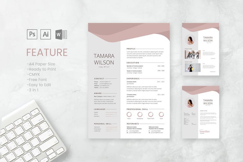 Your cover letter has the crucial job of making sure your application doesn't end up in the scrap pile before you've got the chance to show them how great you are. It needs to make a great first impression. In this article, we're going to focus on how your cover letter looks. A good cover letter design will help you stand out and put you in the best light for the role you're applying for. Besides free cover letter templates for Word, we'll also look at premium Microsoft Word cover letter templates from Envato Elements and GraphicRiver that'll help your cover letter and resume stand out. Reduce Job Hunting Stress by Using Premium Templates for Cover Letters In WordA cover letter template (Word) saves you time and energy by making the design decisions for you. Professionally designed templates help you make a good first impression as a professional who goes the extra mile and pays attention to detail. Premium templates are better than free ones because you get great designs as well as ease of use and customization. Elements and GraphicRiver are great places to find premium cover letter templates for Word.  With Envato Elements, you get unlimited downloads of cover letter templates for Word, for one small monthly subscription. This gives you the freedom to tailor the design of each cover letter to the particular job you're applying for. If you only need the one-off cover letter template (Word doc) then GraphicRiver is an excellent source. You've got a wide choice of templates on a pay-per-use basis. 5 Premium Cover Letter Templates (With Unlimited Use)Envato Elements offers thousands of templates for cover letters in Word. Each one is designed by a professional designer to stand out visually and at the same time be easy to edit. Your Envato Elements subscription gives you unlimited downloads in this creative marketplace. I've picked some of the best ones below: 1. Corporate Lawyer CV Resume This set of resume/CV and cover letter templates for Word was designed specifically for a corporate lawyer position. It also works for any other job that requires the highest levels of professionalism. Built to be easy to edit and personalize, this cover letter template (Word) comes in both A4 and US letter sizes. A Help Guide in PDF format is also included. 2. Simple Resume & Cover Letter Template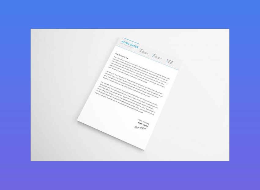 With its subtle colors and smart icons, this cover letter template for Word will help you stand out from other candidates. Choose from blue, black, or yellow color schemes, depending on which one is most suitable for the job. This A4-sized template is fully editable. 3. Corporate Resume & Cover Letter Template With its textured background, unique layout, and use of fonts, this Microsoft Word cover letter template is suited for more casual positions. If you want to show off your creativity, this template may be the answer! It comes in both US letter and A4 sizes. It also gives you a choice of three color schemes. 4. Creative Resume Template & Cover Letter This colorful cover letter template for Microsoft Word is sure to showcase your uniqueness and creativity. It comes with four color schemes to suit a variety of jobs. Plus, its use of shapes and icons makes the cover letter (and matching resume) eye-catching. Whether you need size A4 of US letter, you'll find them both in this template. 5. Stylish Resume & Cover Letter Template Go all-out and express your creativity with the Stylish Resume & Cover Letter Template for Microsoft Word. A colored border and bookmark shape on the upper-left corner catch the eye. Meanwhile, generous white spaces keep your cover letter legible. Choose from a black, off-white, or blue color scheme. This template also comes in both A4 and US letter sizes and is fully editable in Microsoft Word. 5 Premium Word Cover Letter Templates (Pay-per-Use)Looking for a single-use cover letter template for Word? Then GraphicRiver is the source for you. Here you'll find thousands of cover letter templates that are professional looking and editable in Microsoft Word. Below are five of the best ones: 1. CV Template with Word Cover Letter The clean and elegant design of this Word cover letter template will help you make a good first impression. The cover letter and resume templates were designed to make them easy to read and portray professionalism. This A4-sized template comes in Word, Mac Pages, Photoshop, and Illustrator file versions, and is fully editable. 2. Teacher Resume Template for MS Word | Cover Letter This MS Word resume/CV and cover letter template was designed for a teaching position. Its contemporary design works for any job that requires refinement and class. The pay-per-use cover letter template comes with detailed instructions. The designer is also available answer any questions you may have about using and customizing the template. 3. The CV by CodePower Blow away the competition with this eye-catching cover letter template for Word. It features a strong typographic structure while still being easy to use and customize. With more than 80 files, including both DOC and DOCX formats, it's no wonder this resume and cover letter template is a bestseller. 4. Clean Resume/CV Minimalist and clean without being boring, the Clean Resume/CV template is a good choice. Its design makes the most of bold typography and a shot of color to make it eye-catching without going overboard. Detailed instructions help you edit the template. It comes in both A4 and US letter sizes, with both DOC and DOCX file formats. 5. Word Resume & Cover Letter Template Need a standout cover letter and resume to apply for a job in a creative field? This resume and cover letter template (Word) is a good choice. Its muted colors and geometric shapes make your cover letter stand out, while keeping the focus on the content. It also comes with a matching business card template editable in Photoshop. 20 Best Free MS Word Resume Cover Letter TemplatesPremium templates for cover letters in Word generally have the best designs. But sometimes you just don't have any budget. If you're looking for a free cover letter template (Word), you've got many choices. Before looking for a free cover letter templates for Word docs on the web, check Envato's free offerings first. Try out various premium template files (not always resume templates) at no cost to you. Here's the deal:
If Envato Elements and Envato Market aren't featuring free resume cover letter templates for Word this month, you can still find free cover letter templates. Here's a curated list of 20 best free cover letter template Word docs found online: 1. Polished Cover Letter, Designed By Moo Here's an eye-catching Microsoft Word cover letter template with plenty of white space for readability. 2. Sarah Free Cover Letter TemplateThis free cover letter template (Word) features a header for your name, headline, and essential contact information. 3. F/S MonogramMake your initials stand out with the F/S Monogram cover letter template for Word. This two-column layout has a colored sidebar dedicated to your contact information. 4. Minimalist Cover LetterThis template features a clean, modern design with an eye-catching layout. 5. Blue Spheres Cover Letter The Blue Spheres Microsoft Word cover letter template is suitable for creative jobs. Colors and fonts are customizable. 6. Two-Column Cover Letter TemplateThis is a simple, two-letter design for a cover letter that's easy to customize for your needs. 7. Mike Free Cover Letter TemplateHere's a two-column cover letter template doc that features a clean and professional design. It's easy to customize in MS Word. 8. Photo Cover Letter Template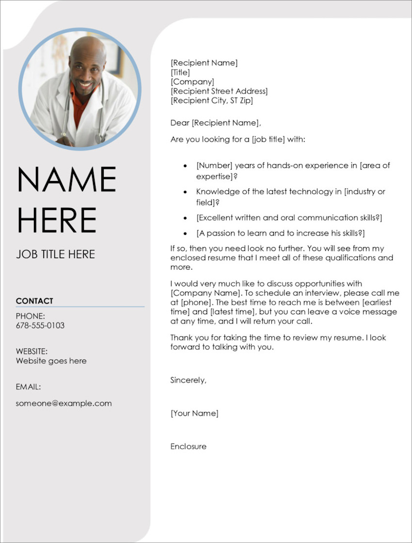 This cover letter template doc features a space for your photo and a shaded left sidebar for your contact information. 9. Blue Sky Cover LetterBlue Sky is a cover letter template that stands out with its image header and space for your photo. 10. John Free Cover Letter TemplateGo for a minimalist look with this free cover letter template for Word docs. It's simple and clean while providing space for the most important information. 11. Inverted Modern Cover LetterUnlike most cover letter template docs, this places your name and contact details at the bottom of the letter. Hence, the name. 12. Contemporary Cover Letter Contemporary Cover Letter has a bold, modern design. A vivid sidebar draws attention to your About Me section and contact details. 13. Stripes Cover Letter TemplateThis accessible free cover letter template for Word download features striped borders for an interesting design. 14. Alisson Free Cover Letter TemplateAlisson is another modern, clean cover letter template. A band of color highlights your contact information and adds visual interest. 15. Modern Chronological Cover LetterThis is another minimalist Microsoft Word cover letter template that emphasizes readability. It's got a matching template for a chronological resume. 16. Headshot Cover Letter As the name implies, the Headshot Cover Letter template includes a space for your photo. It also has a colorful header and sidebar. 17. Megan Free Cover Letter TemplateThis cover letter template doc offers a single-column design with a solid-colored header and border. It's customizable in Word. 18. Green Cube Cover LetterIf you want to include your photograph, Green Cube cover letter template includes space for that purpose. 19. Colorful Cover Letter Template (Word)Here's a colorful cover letter template that stands out with its casual, playful design. 20. Contemporary Photo Cover Letter This contemporary cover letter template for Word download features bold shapes and colors. Its fonts and colors are customizable. How to Customize Your Cover Letter Resume TemplateIn this tutorial, we'll use the premium template, Slive Professional CV Resume Set.  Here's the Premium Template Slive Professional CV Resume Set without edits  Let's get started: 1. How to Change an Object's Color Select Format Object from the menu. This causes a sidebar to open.In the sidebar, click on the Color button. Clicking on this button causes a drop-down menu to appear. Select the color that you want to use for the object. 2. How to Add an Image To add a head shot to your Microsoft word cover letter template or your resume template, click on the Insert tab above the toolbar. Next, click on the Pictures button. Clicking on the Pictures button causes a menu to drop down. From the drop-down menu select the location of where your picture located. Insert the picture 3. How to Change the Font To change the font, go to the Font Menu in the toolbar on the Home tab. Changing the font on your CV cover letter template in Word is an easy way to customize your cover letter or resume without going over the top. 4. How to Change the Font Color To change the color of the font, begin by highlighting the text that you want to change the color of. Click on the Home tab. In the toolbar, select the Font Color button. Selecting the Font Color button causes a color menu to drop down. Select the color that you want the text to be. 5. How to Add a New Text Box Adding a new text box is an easy way to add more text to your Microsoft word cover letter template. To add a new text box, click on the Insert tab above the toolbar and click the Text Box button in the toolbar. Next, select Draw a Text Box from the menu that drops down. Finally, drag the cursor in a diagonal line where you want your text box to be. 5 Quick Design Ideas to Make Great Resume Cover LettersEven when you're working with a cover letter template for Word, you've got a lot of flexibility. That's because professionally designed templates are created to be easy to edit and personalize. As you choose your template and customize it, keep these design ideas in mind. You'll end up with an impressive resume cover letter. Here are five design ideas to get you started: 1. Keep It Simple Keep the cover letter design clean and simple, so it doesn't distract from the content. You still want your information to take center stage. Avoid cover letter designs that are too busy. Those will take the attention away from the most important element: you! Not sure how to write a cover letter? Read these articles: 2. Make It Resonate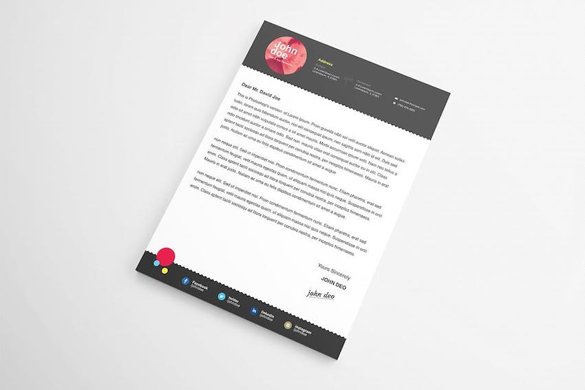 Choose a cover letter template that's aligned with the position you're applying for. If you're applying for a formal corporate job, then the Microsoft Word cover letter template you use should have a corporate look too. But if you're going for a job in the creative field, where torn jeans are acceptable work wear, then your cover letter design should be casual and creative, too. 3. Design for Clarity Never sacrifice clarity for a clever design. Colored backgrounds, clever fonts, and other interesting design elements may be eye-catching. But, if they make your cover letter hard to read, then they're doing you a disservice. Instead, different design elements should make your cover letter easier to read and understand. 4. Add an Optimized Header Many cover letter templates for Word include an optimized header. This means it includes your name, contact information, and a headline. The headline is your personal tagline that describes you and why you're suitable for the position. Keep it to a short phrase, not a sentence. 5. Aim for Visual Consistency Ensure that the look of your cover letter is consistent with your resume. Premium cover letter templates come in a complete package that includes resume templates as well. These are designed to complement each other and have visual coherence. With most of the design decisions made for you, resume and cover letter templates allow you to focus your energies on the content. Discover More Great MS Word Templates for 2020/2021You can find many more Word templates for all the documents you need to create at work. Check out these roundups of more great templates for MS Word:
5 Benefits of Using the Best Cover Letter Templates for Word With Pro DesignsAre you still on the fence about using a Microsoft Word cover letter template to jump ahead in the hiring process? You might wonder about the value of outsourcing the design work. Here are five reasons that you should use a great cover letter template for your next job application in 2021:
Benefits of Envato Elements (The Power of Unlimited Use) Envato Elements is a unique service. It's a flat-rate subscription that includes thousands of great resume cover letter templates for a single flat-rate price. Sign up for Envato Elements. You'll get access to thousands of unlimited use graphics and templates. Choose from web themes to cover letter templates, and more—all for one low price. Find the Best Premium Microsoft Word Resume Templates on Envato Elements (2021)If you're looking for a Microsoft word cover letter template that's good quality and stylish, then you should consider premium templates. There are two options for premium cover letter templates for Word: Envato Elements and Graphic River  For great professional Microsoft Word Resume templates, Envato Elements is a resource for templates. It's a subscription service where you pay a low monthly fee. A membership to Envato Elements will allow you access to unlimited downloads of premium digital content.  The downloads that you can use are stock music, images, videos, fonts, CV cover letter templates for Word and so much more. Often free cover letter template for Word aren't as high quality as the premium templates you'll find on Envato Elements. If you want a resume template that'll stand out in a stack of other resumes, consider a premium template from Envato Elements. Learn More about Your Word Cover Letter TemplateDo you still have questions? Do you still want to know more? We've got a lot tutorials and articles to help you understand your Microsoft Word cover letter template:
Use a Cover Letter Template (Word) to Get that Job InterviewA great cover letter will help your application stand out, so the recruiter reads your resume and calls you for an interview and eventually, the job. Use a cover letter template (Word) to save time so you can focus on the content of the letter. Premium cover letter templates come bundled with resume templates, giving your application a coherent look. They're also designed to be easy to personalize with your own information. Elements and GraphicRiver are excellent sources of premium templates for cover letters in Word. With a subscription to Envato Elements, you get unlimited downloads of all the Word templates you need — along with fonts, photos, icons, and other creative ingredients you want to use on your cover letter and resume. But, for the one-off premium cover letter template, look at GraphicRiver, which offers many creative tools on a pay-per-use basis. Either way, a well-designed cover letter template for Word will make your job hunt less stressful. It'll also give you the edge that just might land you your next job. Editorial Note: Our staff updates this post regularly—adding new Word resume cover letter templates with the best new designs. |
| How to Customize Contact Form 7 for WordPress: Floating Labels Posted: 21 Dec 2020 01:36 AM PST You might have seen forms where the placeholder text is animated when you start typing into that input. This pattern isn't new, yet still remains a popular trend in UX form design. Today, we'll learn the steps needed for adding this behavior into a form built with Contact Form 7 (CF7), one of the most popular WordPress contact form plugins available. What We'll be BuildingHere's a quick video demo of the WordPress form in action: Note: This tutorial assumes that you are somewhat familiar with WordPress and Contact Form 7. Contact Form 7 Plugins on CodecanyonInterested in extending your Contact Form 7 quickly and easily? Codecanyon is home to loads of scripts and plugins to take your CF7 forms to the next level. For example, Multi Step for Contact Form 7 Pro is a great way to improve the UX of your long forms:  With that said, assuming that you've installed Contact Form 7 to a WordPress project, let's get back into the tutorial and discuss the steps needed for animating our CF7 form labels. 1. Remove Unnecessary TagsThe first step is to remove the extra tags that Contact Form 7 throws in the form.  To do this, we'll set the value of the
2. Create the Contact FormThe second step is to create the form from the WordPress dashboard.  We'll use a combination of Contact Form 7 shortcodes along with some custom HTML. The form will consist of two Here's the code that we have to add to the Contact Form 7 editor: <h1>Contact Us</h1> <ul> <li class="form-wrapper"> [text* your-fullname id:your-fullname] <label for="your-fullname">Full Name</label> </li> <li class="form-wrapper"> [email* your-email id:your-email] <label for="your-email">Email</label> </li> <li class="form-wrapper form-textarea-wrapper"> [textarea* your-message id:your-message] <label for="your-message">Message</label> </li> <li class="form-wrapper form-submit-wrapper"> [submit "Submit"] <svg width="24" height="24" viewBox="0 0 24 24"> <path d="M24 21h-24v-18h24v18zm-23-16.477v15.477h22v-15.477l-10.999 10-11.001-10zm21.089-.523h-20.176l10.088 9.171 10.088-9.171z"/> </svg> </li> </ul> 3. Add the CSS Form StylesMoving on, we'll enqueue a new CSS file in the wp_enqueue_style( 'custom', get_template_directory_uri() . '/assets/css/custom.css' ); Inside it, we'll place a bunch of styles:
Most importantly, have a look at how we style the labels. These are absolutely positioned elements and vertically centered inside their Here are all the required styles: /* RESET RULES & INITIAL SET UP –––––––––––––––––––––––––––––––––––––––––––––––––– */ :root { --white: #fff; --black: #222; --brown: #9f4631; --gray: #9a9a9a; --lightgray: #f2f3f5; } * { padding: 0; margin: 0; box-sizing: border-box; border: none; outline: none; } input, textarea { font-family: inherit; font-size: 100%; } [type="submit"] { cursor: pointer; } textarea { resize: none; } ul { list-style: none; } body { font: 20px/24px "IBM Plex Sans", sans-serif; } form { max-width: 600px; padding: 0 15px; margin: 100px auto; } h1 { font-size: 60px; line-height: 78px; margin-bottom: 50px; } /* FORM ELEMENTS –––––––––––––––––––––––––––––––––––––––––––––––––– */ .form-with-animated-labels .form-wrapper { position: relative; } .form-with-animated-labels .form-wrapper + .form-wrapper { margin-top: 40px; } .form-with-animated-labels [type="text"], .form-with-animated-labels [type="email"], .form-with-animated-labels textarea { width: 100%; padding: 15px 10px; border: 1px solid transparent; border-radius: 5px; color: var(--black); background: var(--lightgray); font-size: 18px; } .form-with-animated-labels textarea { height: 150px; } .form-with-animated-labels [type="text"]:focus, .form-with-animated-labels [type="email"]:focus, .form-with-animated-labels textarea:focus { border-color: var(--brown); } .form-with-animated-labels label { position: absolute; top: 50%; left: 10px; font-size: 18px; transform: translateY(-50%); color: var(--gray); transition: all 0.25s ease-in-out; } .form-with-animated-labels .form-textarea-wrapper label { top: 10px; transform: none; } .form-with-animated-labels label.focused { top: -22px; transform: none; font-size: 13px; font-weight: bold; color: var(--black); } .form-with-animated-labels [type="submit"] { min-width: 160px; padding: 20px 4px; border-radius: 10px; width: 100%; font-size: 22px; font-weight: bold; text-transform: uppercase; box-shadow: 0 5px 15px rgba(0, 0, 0, 0.08); color: var(--white); background: var(--brown); } .form-with-animated-labels .form-submit-wrapper svg { position: absolute; top: 0; left: 0; transform: rotate(40deg); opacity: 0.75; fill: var(--white); width: 60px; height: 60px; } .form-with-animated-labels .wpcf7-form-control-wrap { position: static; } .form-with-animated-labels .wpcf7-not-valid-tip { position: absolute; bottom: 100%; right: 10px; font-size: 12px; } /* OUTPUT MESSAGES CF7 –––––––––––––––––––––––––––––––––––––––––––––––––– */ .wpcf7 form .wpcf7-response-output { font-size: 18px; padding: 10px; margin: 0; } .wpcf7 form.invalid .wpcf7-response-output, .wpcf7 form.unaccepted .wpcf7-response-output, .wpcf7 form.sent .wpcf7-response-output { border-color: var(--brown); } Note: For this example, I'm using a vanilla theme. Depending on your theme though, some of these styles may be overridden. Given that fact, if the form doesn't appear as expected in your project, be sure to check your theme styles and make the necessary changes. Tip: You can use conditional tags to load this CSS file only on the pages that include the form. Why a CSS-Only Approach Won't WorkBefore moving on, let me clarify one thing. You have probably seen many CSS-only implementations for creating floating labels on the web. These mainly take advantage of the "CSS checkbox hack technique". Indeed, it's a very handy technique which we have discussed many times in the past. Unfortunately in this case, we cannot use it. If you inspect the markup that is generated from Contact Form 7's shortcodes, you'll notice that all form controls are wrapped within a  As a result, the controls and their associated labels aren't siblings and a style like this won't have any effect: .form-with-animated-labels [type="text"]:focus + label { // styles for the animation here } 4. Add the JavaScriptAs a next step, we'll enqueue a new JavaScript file in the wp_enqueue_script( 'custom', get_template_directory_uri() . '/assets/js/custom.js', array(), '', true ); Inside it, we'll perform the following actions:
Here's the corresponding JavaScript code: const formsWithAnimatedLabels = document.querySelectorAll( ".form-with-animated-labels" ); const focusedClass = "focused"; for (const form of formsWithAnimatedLabels) { const formControls = form.querySelectorAll( '[type="text"], [type="email"], textarea' ); for (const formControl of formControls) { formControl.addEventListener("focus", function () { this.parentElement.nextElementSibling.classList.add(focusedClass); }); formControl.addEventListener("blur", function () { if (!this.value) { this.parentElement.nextElementSibling.classList.remove( focusedClass ); } }); } form.parentElement.addEventListener("wpcf7mailsent", function () { const labels = document.querySelectorAll(".focused"); for (const label of labels) { label.classList.remove(focusedClass); } }); } Tip: You can use conditional tags to load this JavaScript file only on the pages that include the form. 5. Call the Contact FormLast but not least, we'll include the generated Contact Form 7 shortcode in the desired part of our project: [contact-form-7 id="5" title="Contact Form With Animated Labels" html_class="form-with-animated-labels"] Notice the class added via the ConclusionAnd we're done, folks! In this short tutorial, we discussed a simple method for customizing the look and feel of a Contact Form 7 form by adding floating labels. I'm sure there will be other effective solutions as well, yet this one seems to do its job! Hopefully you will give it a try in one of your upcoming WordPress projects. Have you ever created such an effect with Contact Form 7? Have you managed to come up with a CSS-only solution? Share your thoughts in the comments below. As always, thanks a lot for reading! More Contact Form 7 Customization and Floating LabelsIf you are curious to learn how to build a responsive handmade SVG form with Contact Form 7, or would like to dive deeper into floating labels, take a look at these tutorials: |
| 20+ Cool Clothing & T-Shirt Company Brand Logo Designs for 2021 Posted: 21 Dec 2020 01:00 AM PST More than ever, consumers want to wear clothing that matches their identities. The logos they wear reflect who they are and what they believe. If you're launching a clothing brand in 2021, it's crucial that you build a logo that stands out from the crowd. It should match the vision you've got for your new fashion line.  Let's learn how to use Placeit to build a memorable apparel logo that'll find its way to the top of the rack! You'll also discover some clothing logo ideas from Envato Elements. 5 Quick Logo Design Tips from Top Clothing BrandsIn this tutorial, you'll learn how to build your own clothing logo with some help from starter templates. You'll learn to use Placeit, a browser-based clothing logo maker, to create an excellent fashion brand logo. Before we dive into building a clothing brand logo, it helps to draw some inspiration from some of the most ubiquitous designs. Let's learn from some of the world's most popular fashion brands with five clothing logo design lessons below: Note: The logos below are for illustrative purposes only. The companies who own the logos below aren't affiliated with Placeit or Envato. 1. Focus on TypographySome of the world's most memorable clothing brand logos use only text and initials to capture the spirit of the brand. Focusing on typography means considering custom font faces that aren't commonplace. Eschew Georgia and Times New Roman for totally custom logo options for T-shirts that won't easily be replicated.  2. Align the Logo With the BrandAbove all, your logo should capture the same spirit that your clothing and accessories do. It's all about aligning a logo with the brand's intent so that everything feels like a natural fit. The Ray-Ban logo is a perfect example of this. The simplicity, clean text, and tilt feels like the perfect fit for the fashionable brand known for its sunglasses.  3. Stay ConsistentOnce you've rolled out your logo, it's a must that you commit to using it. I've seen brands that constantly shift their logo and identity. A constantly revolving set of logos makes it impossible for consumers to connect. There's no better example of consistency than Nike's steadfast commitment to the "swoosh." It's quite clearly the face of the brand, and it might be one of the best $35 ever spent.  4. Simplicity Means MemorabilityMake it memorable and make it simple. Logos like Chanel remind me that less is truly more. That iconic look of two Cs perfectly captures the creator's intent. The simplicity also means that it works on practically any clothing or accessory.  5. Abstract Designs Stand OutDon't think about building your apparel logo too narrowly. It's perfectly fine to borrow elements from culture or practically anywhere to bring your clothing logo design to life. Take the Brooks Brothers logo, for example. The Golden Fleece hardly screams "I'm a southern men's fashion brand," but it's come to be an iconic symbol of well-dressed southern business professionals.  18 Clothing & T-Shirt Company Brand Logo Designs for 2021Now that you've seen what some popular clothing brand logos look like, let's examine 18 of the best designs for clothing brand logos on Placeit: 1. Clothing Brand Logo Maker With Tattoo Illustration Looking for a logo with classic tattoo illustrations? This clothing logo is perfect for an urban clothing line with fierce touches. The Clothing Brand Logo Maker With Tattoo Illustrations will look great on your merchandise. 2. Clothing Logo Maker for Kids' Brands If your clothing brand logo needs to capture a fun and playful effect, this is one of my favorite choices. Animal shapes and a fingerprint style are sure to be noticed. This T-shirt logo feels perfect for a light-hearted clothing brand that would appeal perfectly to kids' clothing brands. 3. Clothing Logo Maker for Boutiques and Brands When you're building out your clothing brand logo, one route that you can take is an artisanal approach. Brands like this do a great job of capturing the touch of a designer in the branding. Use a logo like this with an almost hand-painted script to capture a look and feel that's perfectly artistic. 4. Fresh Logo Design Template for Clothing Brand Make no mistake: this clothing brand logo means business. A big, bold initial means that your brand likely plays a big part if you use this clothing logo design option. Try it out for a way to permanently attach a key initial to your next clothing brand launch. 5. Logo Maker for Tennis Shoe Stores Shoe culture is as relevant as ever in modern fashion. Even if you're designing a T-shirt logo or looking for general clothing logo ideas, a shoe logo still captures the spirit of a modern fashion brand. If your apparel line includes footwear, this might just be the perfect way to capture both those needs in a single logo. 6. Logo Maker for Indie Clothing Brands Clothing brand logos run the gamut of designs and styles, and this preset designed for indie clothing brands is the perfect example. You can use built-in art designs like a flower shape to bring a unique clothing logo design to life. It's a great reminder that your T-shirt logo can incorporate so much more than simple text and shapes, and that you can build it all in Placeit. 7. Signature Logo Maker for Fashion Brand Some of the best brands make use of simple signature elements. This T-shirt logo design is the perfect starting point for that type of look. As always, it's easy to change the brand colors, built-in text, and font, thanks to Placeit. 8. Clothing Brand Maker - Circular Design This clothing brand logo has the perfect vintage and elegant feel that'll stand out. Simple, flowery designs and elegant text combine perfectly in the preset you can see in the preview image. Customize it for a brand that combines lifestyle with fashion to build a connection with your potential customer. 9. Cool T-Shirt Brand Logo Design Template Some of the best clothing brand logos keep it simple, with only a key letter or two that acts as the face of the brand. This example captures that exact spirit. One of the strengths of using a look like this is that it's easily visible from far away. Choose a design like this for the type of T-shirt logo that someone recognizes from across the room. 10. Seamstress Logo Design Template The Seamstress clothing brand logo preset has that handmade, craftsman feel to it. Building a great logo is all about aligning the look with the mission of the brand. If your clothing brand is all about the attention to detail and work that goes into the product, this might just be the perfect logo for you. 11. Logo Maker for Fishing Supplies Store A number of the best clothing brand logos capture the spirit of the sea, and it's easy to see why. The beach and the ocean are home to many consumers' best memories, so it makes perfect sense that logos try to capture this. Use this T-shirt logo design to bring a maritime feel to your next apparel line. 12. Logo Design Maker for Outfitters Brand Fly your T-shirt logo design high with this brand! If your new company specializes specifically in the world of cool logo T-shirts, this is the perfect logo to use. Choose it if you want your potential consumer to know that you're in the business of T-shirts. 13. Logo Template With 90s Style for Apparel Another clothing logo design concept is to use something more abstract. The strength of this is that can act as the face of your brand in a way that transcends any medium. Choose an abstract design like the one above if you hope to see your clothing logo design on practically any medium. 14. Fashion Shop Logo Maker With Curved Text A simple, clean clothing logo design like this one wastes no space. This is flexible enough to be used as a logo design for practically any medium but shines for modern apparel thanks to its simplicity and style. 15. Kids Tee Logo Maker With Dinosaur Graphics What child wouldn't want to add a dinosaur to practically every T-shirt they own? Even I'm thinking about adding more dinos to my wardrobe after checking out this T-shirt logo design. You can use it too, with easy customizations of the brand name, color palette, and more. 16. Apparel Stores With 90s Graphic Logo If the term "shirts" is in your clothing company's name, this is a great choice thanks to that custom "S" character in the middle. It's a bit abstract, but that's just the type of T-shirt logo it sometimes takes to stand out from the crowd. Keep this in mind if your company name fits the bill. 17. Text Only Logo Maker for Clothes Brand Rounding out our selections is a classy company logo T-shirt design that's text-oriented. A logo like this one's ideal for an apparel line that could include a wide variety of items since it's simple and text-based. Still, the simplicity of this logo is a strength because it feels classy and could be applied to practically any brand. 18. Clothing Brand Logo Creator With Astrology Sign Astrology signs make perfect, trending clothing logos. This Clothing Brand Logo Creator With Astrology Sign will stand out and look awesome as a brand identity. Customize it to your heart's content with Placeit's clothing logo maker. How to Make a T-Shirt (Clothing Brand) Logo Design OnlineEarlier in this tutorial, we highlighted some of the best clothing brand logos that you can build with Placeit. This is an amazing T-shirt logo design maker tool that lives entirely in your web browser and can help you build an easy logo in just a few clicks. Let's walk through building a fashion brand logo using Placeit: 1. Choose a Starting Template PresetYou've already seen 18 of the best fashion brand logo templates, so make sure you start with a template. It doesn't have to match exactly what you've got in mind. Just look for a few key elements that you can see potential in. Click on one of the templates above to launch your design.  2. Update the GraphicThe starting logo design may not have exactly the image you've got in mind, but that's okay. Just search for a matching idea on the right side, and then choose a matching image to update the logo. In the example below, I quickly swapped in a chick logo to match my brand identity.  3. Add Your TextNext, you can update the text using the boxes on the left side. Type over the placeholders to add your brand identity. You can also toggle off one of the text boxes, as you can see in the example below.  4. Adjust the Branding ElementsMatching the clothing logo design to the brand is a must. The best way to do that is to incorporate the brand's color palette in your logo. Click on the color drop-downs on the right side to change the colors to your key color selections.  At this stage, you can easily click on download to export the finished logo, both on a transparent background and with the pastel backdrop we created above. 5. Bring the Logo to LifeIf you want your audience to see the logo in the real world, it helps to use another amazing tool from Placeit: a T-shirt mockup tool! With this template creator, just drop in your logo and you'll see it in a realistic product shot. It's a great way to build a marketing image.  To learn more about Placeit's tool, check out the guide below: Totally Customizable Clothing Brand Logos (With Unlimited Use)While Placeit is a browser-based clothing logo design maker to help you create your next clothing brand logo, you can also use offline templates to build your next apparel graphic. If you're more comfortable in graphic design apps like Adobe Illustrator or Photoshop, Envato Elements might be the perfect choice for you. A single subscription to Elements unlocks everything, including hundreds of logos that are fit for clothing brands. Here are my favorite templates from Envato Elements to create your next clothing logo: 1. Salt Water Logo This attractive nautical logo template would easily work for a custom logo T-shirt or other clothing brand logo. This easy-to-use template can be modified using Adobe Illustrator. Your customers are sure to notice the distinct look and ocean theme. 2. Floral Business Logos This floral-inspired logo template set includes four different logos. The elegant look of these logos is perfect for fashion-related company logo T-shirts. You can customize the colors to match your brand. The templates come with an AI (Adobe Illustrator) file and a CDR (CorelDraw) file. 3. Retro Industrial Do you love the retro look? Maybe your company sells vintage clothing. It makes sense to have a clothing logo design that matches your company's mission. In this logo template set, you'll find eight hand-made logos that you can resize, recolor, or otherwise modify to fit your brand. 4. Fashion Logo Here's an Adobe Illustrator logo template designed specifically for clothing brand logos and other fashion-related needs. You'll love the crisp, modern feel to this one, as well as the ease of editing. 5. Hunter Vintage Does your clothing brand specialize in outdoor clothing? Consider using one of the ten logo designs from the Hunter Vintage collection as a source of great clothing logo ideas. This set is perfect for T-shirt logo designs and other custom clothing logos. Explore More Logo Design Resources and InspirationI hope you liked the professional clothing logo designs I showed you. Now you know how to use Placeit's logo maker. Before you leave, I'll share with you even more logo design resources, tutorials, and templates:
Create a Fashion Brand Logo TodayNow that we've reviewed the best options for clothing design logos, it's time for you to jump into designing your own. You can use Placeit to build a clothing brand logo in your web browser, or take your design skills offline with clothing logo templates from Envato Elements. And either choice can be combined with the Placeit T-shirt design maker tool to bring your design into the real world! Remember: build a logo that captures the spirit of your brand. With a bit of work, you might see your logo on clothing everywhere. |
| How to Save a PDF in Affinity Publisher (For Web & for Print) Posted: 20 Dec 2020 11:00 PM PST  When working with Affinity Publisher, you will often need to publish your work as a PDF document. PDF documents are one of the best ways to share your Affinity Publisher designs. Whether it's a printed brochure or a design brief proposal for a website, PDF will often be the document type that is expected for your clients. In this quick tip, ill show you how to export to PDF from Affinity Publisher both for web and for print. We'll open or start a project with Affinity Publisher, edit PDF settings, and then export them as a PDF document. What You'll Learn in This Tutorial
Follow along with us over on our Envato Tuts+ Youtube Channel: What You'll NeedYou will need an Affinity Publisher project file. This can be a project for either web or print that you've been working on or need to export as a PDF. We'll be using designs from Envato Elements by taking advantage of the fact that Affinity Publisher can import EPS files. This gives us a lot of options for Affinity Publisher templates! For exporting to web, we'll be using this email enewsletter template from Envato Elements. For exporting to print, we'll be using this project proposal template from Envato Elements. Of course, you can use any project you want! 1. How Do I Save a PDF in Affinity Publisher for the Web?Step 1Open up your project, and then go to File > Export...  Step 2This will open the export dialog window. By default, this will be set to PNG. From the tabs, find and select the PDF icon.  Step 3This will open the export options for PDF documents. When exporting to PDF for web from Affinity Publisher, we will want to consider file size in our choice. From the preset dropdown, select PDF (digital - small size).  Step 4The presets give us a good starting point. We chose digital to keep the file size low, this is always a good practice for delivering content on the web. Let's review these settings!  Step 5Raster DPIThe DPI is set to 72. This is usually a good bet as many monitors are set to 72 DPI. It's one of the most common DPI settings for digital media. This will keep our file size nice and low.  Step 6Include BleedThe Include Bleed option will include the margin areas in your document. When working for print, we use the bleed to allow space around our design. Depending on how you designed your project, you may or may not have had this space in mind. If you're not sure, leave it unchecked.  Step 7Preview Export When CompleteIf this is checked, your Affinity Publisher PDF will open automatically when you export. Use this if it's convenient for your workflow.  Step 8AreaBy default, you will typically want the entire document to be included. However, with this dropdown, you can export part of your document based on your current selection.  Step 9When adjusting these settings, pay special attention to the estimated file size on the bottom left. If you're exporting a PDF for web, you probably have a good idea of what an acceptable file size is. For the most part, the raster DPI setting will have the most impact on this. When you're happy with your settings, go ahead and click the Export button on the bottom right.  Step 10Now the export file dialog window will open. Select a folder on your desktop, and then click the Save button. There you have it! You have saved an Affinity Publisher PDF that's suitable for distribution on the web.  2. How Do I Save a PDF in Affinity Publisher for Print?Step 1With your chosen print project, go to File > Export...  Step 2Now the export dialog window will open. This will be set to PNG by default. From the tabs, find and select the PDF icon.  Step 3Now the export options for PDF documents will be displayed. When exporting from Affinity Publisher for print, one of our major concerns will be quality. From the preset dropdown, select PDF (for print).  Step 4This preset will give us a good starting point for our print-ready PDF. Let's review these settings!  Step 5Raster DPIThe DPI is set to 300. This is a high DPI, which is usually the minimum you want when printing a document. Anything lower, and the quality of your document may suffer.  Step 6Include BleedThe Include Bleed option will include the margin areas in your document. As this export is intended for print, you may need this option selected. Projects which require bleeds would be books or newspapers. If what you plan to print has a bleed, you will want to have this checked.  Step 7Preview Export When CompleteIf this is checked, your PDF will open automatically when you export. Use this if it's convenient for your workflow.  Step 8AreaFor the purposes of print, you will most certainly want to leave this unchecked. However, with this dropdown, you can export part of your document based on your current selection if you desire.  Step 9When adjusting these settings, you may want to pay attention to Estimated File Size on the bottom left. Don't worry too much when exporting for print—in fact, it's normal for print-ready projects to be rather large in file size. The high DPI will make sure of that! It's always a good idea to keep file size in mind, though. Once you're happy with your settings, go ahead and click the Export button on the bottom right.  Step 10Now the export file dialog window will open. Select a folder on your desktop and then click the Save button. There you have it! You have saved a PDF document from Affinity Publisher that's suitable for print.  Why Export as PDF?Exporting to PDF is one of the most accessible ways to distribute your work. Whether it is for delivery on the web or for print, it's going to be an option that just about anyone is going to be able to view. Most browsers can open up a PDF document with no problem, and with the web export settings, you can easily get your documents small enough to share them through email or place them on your website. For print, PDFs have a lot of printing options, making them a really easy way to deliver documents to clients ready for print, or even printing them yourself. We hope you enjoyed this quick tip on how to export to PDF from Affinity Publisher. You should now be able to create documents in Affinity Publisher, edit PDFs, and export them. If you found this quick tip useful, check out these Affinity Publisher templates and tutorials.
|
| You are subscribed to email updates from Envato Tuts+ Tutorials. To stop receiving these emails, you may unsubscribe now. | Email delivery powered by Google |
| Google, 1600 Amphitheatre Parkway, Mountain View, CA 94043, United States | |


.jpg)

.jpg)


0 Comments: