WPlook Themes |
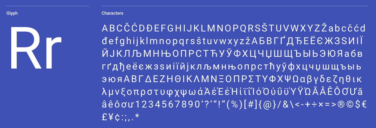
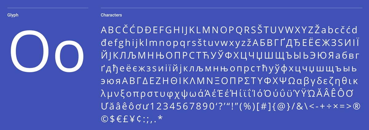
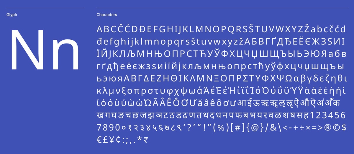
| Top 10 Sans-Serif Fonts Used by Web Designers in 2020 Posted: 09 Mar 2020 09:27 AM PDT In lettering and typography, sans-serif fonts, sans serif, gothic, or simply sans letterform is one that does not have to extend features called “serifs” toward the end of strokes. Sans-serif fonts have a tendency to have less line width variation than serif fonts. In most print, they are regularly used for headings rather than for body text. They are frequently used to pass simplicity and modernity or minimalism. Sans-serif fonts have turned into the most predominant for display of content on PC screens. On lower-resolution digital displays, fine details like serifs may vanish or appear too large. The term originates from the French word sans, signifying “without” and “serif” of uncertain origin, possibly from the Dutch word schreef meaning “line” or pen-stroke. 1. Roboto The principal designer is Christian Robertson. The font is used by over 20M websites and in the last week, the Google Font API displayed the font over 55B times. It has a dual nature, a mechanical skeleton and the forms are largely geometric. In the meantime, the font includes friendly and open curves. While some The Perfect Google Font Combination for this sans-serif font is: Open Sans, Lato, Raleway, Oswald, Playfair Display. We use Roboto Sans-Serif Font in multiple WordPress Themes: Charity Life, Conference, Health & Medical, One, etc. Download Font2. Mina The font has been designed by Suman Bhandary and Natanael Gama. The font is used by over 1k websites and in the last week the Google API displayed the font over 186K times. This Sans-Serif Font is a contemporary geometric Bangla (Bengali) and Latin family. The family comes in two weights, Regular and Bold. It began by extending the Latin font Exo, at first designed by Natanael Gama. It functions well as a display typeface, but on the other hand is designed to perform at small to intermediate text sizes. The Perfect Font pairing is with Roboto, Open Sans, Montserrat, Lato, Raleway. Download Font3. Open Sans The Open Sans font has been designed by Steve Matteson. The font is used by over 21M websites and in the last week the Google Font API displayed the font over 28.7B times. Open Sans is a humanist sans serif typeface designed by Steve Matteson, Type Director of Ascender Corp. This version contains the total 897 character set, which incorporates the standard ISO Latin 1, Latin CE, Greek and Cyrillic character sets. Open Sans was designed with an upright stress, open forms and a neutral, yet friendly appearance. It was optimized for print, web, and mobile interfaces, and has great legibility characteristics in its letterforms. The Perfect Font Combination is with Open Sans, Lato, Oswald, Roboto, 4. Lato The Lato font has been designed by Łukasz Dziedzic. Lato is used by 11M Websites Worldwide and it’s very popular in USA. Consistently the Google API shows the font over 7.90B times. Lato is a sans serif typeface family started in the summer of 2010 by Warsaw-based designer Łukasz Dziedzic ("Lato" means "Summer" in Polish). In December 2010 the Lato family was published under the Open Font License by his foundry tyPoland, with support from Google. The semi-rounded details of the letters give Lato a feeling of warmth, while the strong structure gives solidness and seriousness. "Male and female, serious but friendly. The Perfect Font pairing is with Roboto, Open Sans, Oswald, 5. Noto Sans Nano Sans, it’s a Sans-Serif font designed by Google. Over 1M websites are using the font and Google API displays the font over 1.69B times in the last week. Noto makes the web more delightful crosswise platforms for all languages. Right now, Noto covers more than 30 scripts, and will cover all of Unicode later on. This is the Sans Latin, Greek and Cyrillic family. It has Regular, Bold, Italic and Bold Italic styles and is hinted. It is derived from Droid, and like Droid it has a serif sister family, Noto Serif. The Perfect Font Combination is with Noto Serif, Open Sans, Inconsolata, Roboto, Source Sans Pro Download Font6. Montserrat Montserrat was designed by Julieta Ulanovsky and used by over 5M website. The old posters and signs in the traditional Montserrat neighborhood of Buenos Aires motivated Julieta Ulanovsky to design this typeface and rescue the beauty of urban typography that emerged in the first half of the twentieth century. As urban development changes that place, it will never return to its original form and loses forever the designs that are so special and unique. The letters that inspired this project have work, commitment, care, color, contrast, light and life, day and night! These are the sorts that influence the city look so wonderful. The Montserrat Project started with the idea to rescue what is in Montserrat and set it free under a libre license, the SIL Open Font License. Perfect Font pairing is with Open Sans, Roboto, Raleway, Lato, Oswald Download Font7. Oswald Designed by Vernon Adams, the Oswald font is an adjusting of the classic style historically represented by the ‘Alternate Gothic’ sans serif typefaces. The characters of Oswald were at first re-drawn and reformed to better fit the pixel grid of standard digital screens. Oswald is designed to be used freely across the internet by web browsers on desktop computers, laptops and mobile devices. The font is utilized by 7.2M websites and in the last week the Google API displaye the font 4.15B times. The Perfect Font Combination is with Lato, Roboto, Open Sans, 8. Roboto Condensed Like Roboto Font, the Roboto Condensed has been designed by Christian Robertson. Roboto has a dual nature. It has a mechanical skeleton and the forms are largely geometric. In the meantime, the font features friendly and open curves. While some grotesks distort their letterforms to force a rigid rhythm, Roboto doesn't compromise, allowing letters to be settled into their natural width. This makes for a more natural reading rhythm more commonly found in humanist and serif types. It’s used by over 2.3M websites and every week the Google API displayed the font over 4.23B times. The Perfect Font Combination has been tried and tested with Roboto, Open Sans, Lato, Oswald, 9. Source Sans Pro Source® Sans Pro, Adobe’s first open source typeface family, was designed by Paul D. Hunt. It is a sans serif typeface planned to function well in user interfaces. The font is used by over 4.2M websites. The Perfect Font Combination has been tried and tested with Open Sans, Lato, Roboto, Oswald, 10. |
| You are subscribed to email updates from WPlook Themes. To stop receiving these emails, you may unsubscribe now. | Email delivery powered by Google |
| Google, 1600 Amphitheatre Parkway, Mountain View, CA 94043, United States | |


0 Comments: